Model Output Analysis and Climate Change Impact Analysis#
Now that we have run MATILDA so many times we finally want to have a look at the results. In this notebook we will…
…create custom data frames containing individual output variables from all ensemble members,
…plot the ensemble mean of these variables with a 90% confidence interval,
…and create an interactive application to explore the results.
…calculate a set of meterological and hydrological indicators frequently used in climate impact studies,
…plot these climate change indcators in interactive applications,
…and finally create summary figures for our catchment through the 21st century.
Custom dataframes#
First, we read our paths from the config.ini again and use some helper functions to convert our stored MATILDA output back into a dictionary.
Importing MATILDA scenarios...
Done!
At the moment, the structure of the ensemble output is as follows:
To analyze all projections of a single variable, we need to rearrange the data. The custom_df_matilda() function returns a dataframe with all ensemble members for a given variable and scenario resampled to a desired frequency, e.g. the total annual runoff under SSP 2.
Total Annual Runoff Projections across Ensemble Members:

            ACCESS-CM2  ACCESS-ESM1-5  BCC-CSM2-MR       CESM2  CESM2-WACCM  \
TIMESTAMP
2000-12-31  748.845248     748.845248   748.845248  748.845248   748.845248
2001-12-31  730.107694     730.107694   730.107694  730.107694   730.107694
2002-12-31  721.196245     721.196245   721.196245  721.196245   721.196245
2003-12-31  607.878225     607.878225   607.878225  607.878225   607.878225
2004-12-31  668.633480     668.633480   668.633480  668.633480   668.633480

            CMCC-CM2-SR5   CMCC-ESM2  CNRM-CM6-1  CNRM-ESM2-1     CanESM5  \
TIMESTAMP
2000-12-31    748.845248  748.845248  748.845248   748.845248  748.845248
2001-12-31    730.107694  730.107694  730.107694   730.107694  730.107694
2002-12-31    721.196245  721.196245  721.196245   721.196245  721.196245
2003-12-31    607.878225  607.878225  607.878225   607.878225  607.878225
2004-12-31    668.633480  668.633480  668.633480   668.633480  668.633480

            ...  KACE-1-0-G  MIROC-ES2L      MIROC6  MPI-ESM1-2-HR  \
TIMESTAMP   ...
2000-12-31  ...  748.845248  748.845248  748.845248     748.845248
2001-12-31  ...  730.107694  730.107694  730.107694     730.107694
2002-12-31  ...  721.196245  721.196245  721.196245     721.196245
2003-12-31  ...  607.878225  607.878225  607.878225     607.878225
2004-12-31  ...  668.633480  668.633480  668.633480     668.633480

            MPI-ESM1-2-LR  MRI-ESM2-0       NESM3  NorESM2-MM     TaiESM1  \
TIMESTAMP
2000-12-31     748.845248  748.845248  748.845248  748.845248  748.845248
2001-12-31     730.107694  730.107694  730.107694  730.107694  730.107694
2002-12-31     721.196245  721.196245  721.196245  721.196245  721.196245
2003-12-31     607.878225  607.878225  607.878225  607.878225  607.878225
2004-12-31     668.633480  668.633480  668.633480  668.633480  668.633480

            UKESM1-0-LL
TIMESTAMP
2000-12-31   748.845248
2001-12-31   730.107694
2002-12-31   721.196245
2003-12-31   607.878225
2004-12-31   668.633480

[5 rows x 31 columns]
Plot ensemble mean with confidence interval#
Showing curves for every individual ensemble member in one figure gets confusing. A standard way to visualize this is to plot the mean (or median) across the ensemble with a confidence interval. We choose a 95% confidence interval, meaning that based on this sample of 31 climate models, there is a 95% probability that the “true” mean lies within this interval. For that we are using the confidence_interval() function.

95% Confidence Intervals for Total Annual Runoff Projections:

                  mean    ci_lower    ci_upper
TIMESTAMP
2000-12-31  748.845248  748.845248  748.845248
2001-12-31  730.107694  730.107694  730.107694
2002-12-31  721.196245  721.196245  721.196245
2003-12-31  607.878225  607.878225  607.878225
2004-12-31  668.633480  668.633480  668.633480
...                ...         ...         ...
2096-12-31  563.655730  527.077593  600.233868
2097-12-31  581.046050  552.587005  609.505096
2098-12-31  599.502416  567.452945  631.551887
2099-12-31  586.305365  545.603933  627.006796
2100-12-31  602.892637  569.832498  635.952776

[101 rows x 3 columns]
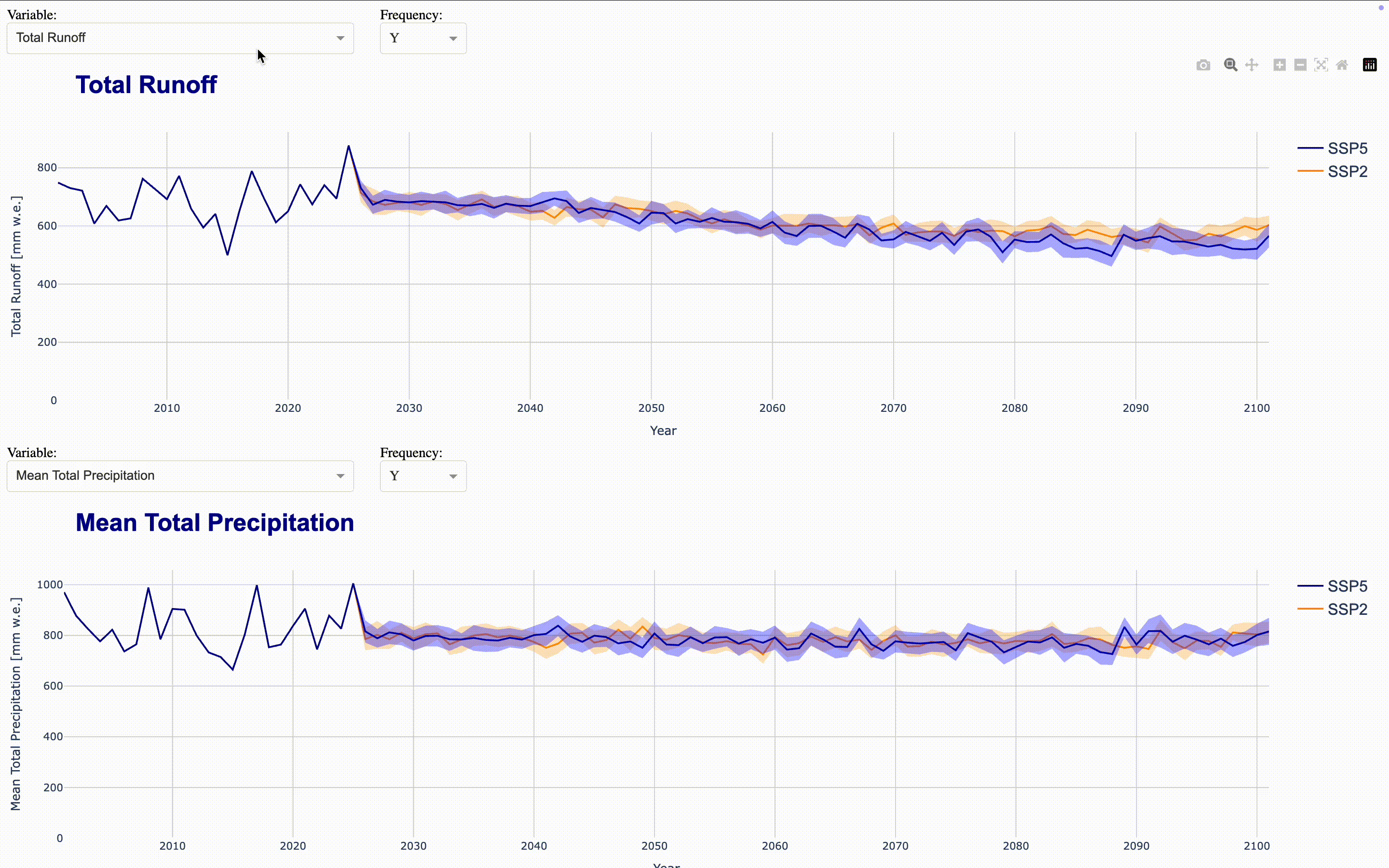
We are going to use the plotly library again to create interactive plots. For now, let’s plot total discharge over all ensemble members. You can change the variables and resampling frequency in the example at will.
Interactive plotting application#
To make the full dataset more accessible, we can integrate these figures into an interactive application using ploty.Dash. This launches a Dash server that updates the figures as you select variables and frequencies in the dropdown menus. To compare time series, you can align multiple figures in the same application. The demo application aligns four figures showing total runoff, total precipitation, runoff_from_glaciers, and glacier area by default directly in the output cell. If you want to display the complete application in a separate Jupyter tab, set display_mode='tab'.
Dash app running on http://127.0.0.1:8051/
Climate Change Impact Analysis#
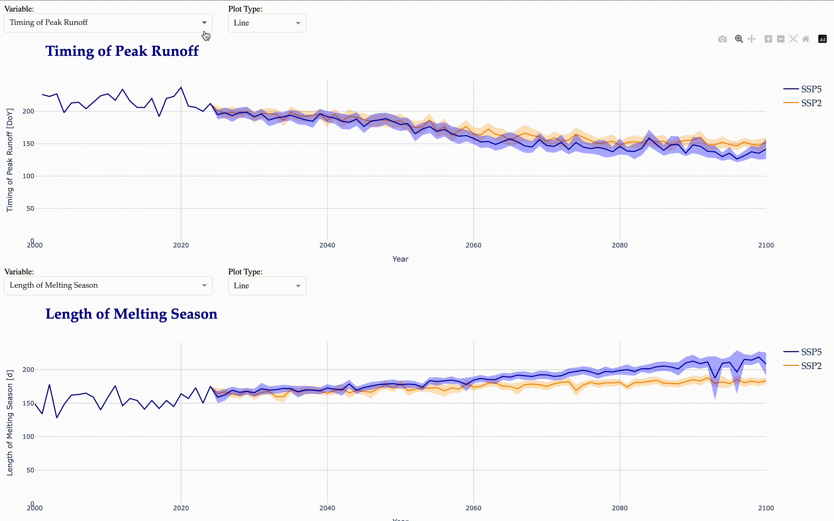
To highlight the impacts of climate change on our catchment we can calculate a set of indicators frequently used in climate impact studies and visualize them in a Dash board as well. The calculate_indicators() function calculates the following statistics for all ensemble members in annual resolution:
Month with minimum/maximum precipitation
Timing of Peak Runoff
Begin, End, and Length of the melting season
Potential and Actual Aridity
Total Length of Dry Spells
Average Length and Frequency of Low Flow Events
Average Length and Frequency of High Flow Events
5th Percentile of Total Runoff
50th Percentile of Total Runoff
95th Percentile of Total Runoff
Climatic Water Balance
SPI (Standardized Precipitation Index) and SPEI (Standardized Precipitation Evapotranspiration Index) for 1, 3, 6, 12, and 24 months
For details on these metrics check the source code.
Calculating Climate Change Indicators...
SSP2: 100%|██████████| 31/31 [00:10<00:00,  3.07it/s]
SSP5: 100%|██████████| 31/31 [00:09<00:00,  3.13it/s]
Writing Indicators To File...
Now, we create another interactive application to visualize the calculated indicators.
Dash app running on http://127.0.0.1:8052/
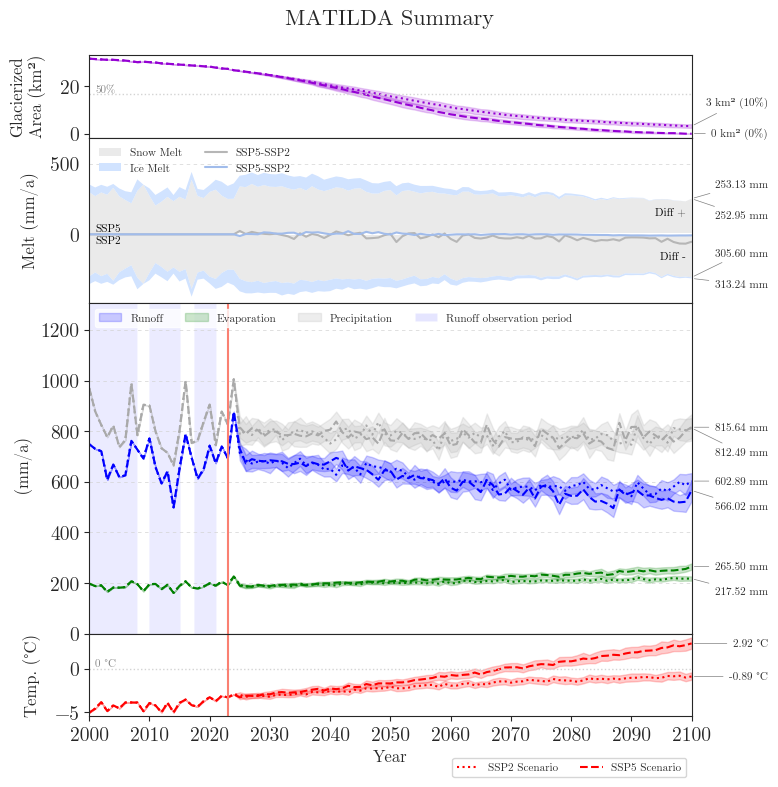
Matilda Summary#
While interactive applications are great to explore, they require a lot of data and a running server. Therefore, we create two summary figures to illustrate the most important results in a compact way.
The first figure shows the forcing data, the glacier area and all components of the water balance over the course of the 21st century.
total_runoff extracted for SSP2
total_runoff extracted for SSP5
actual_evaporation extracted for SSP2
actual_evaporation extracted for SSP5
total_precipitation extracted for SSP2
total_precipitation extracted for SSP5
glacier_area extracted for SSP2
glacier_area extracted for SSP5
snow_melt_on_glaciers extracted for SSP2
snow_melt_on_glaciers extracted for SSP5
ice_melt_on_glaciers extracted for SSP2
ice_melt_on_glaciers extracted for SSP5
melt_off_glaciers extracted for SSP2
melt_off_glaciers extracted for SSP5
Creating MATILDA summary plot...
Plotting glacierized area...
Plotting snow & ice melt...
Plotting runoff & precipitation...
Plotting temperature...
Creating legends...
Final formatting...
Figure saved to output//figures/summary_ensemble.png
>> DONE! <<
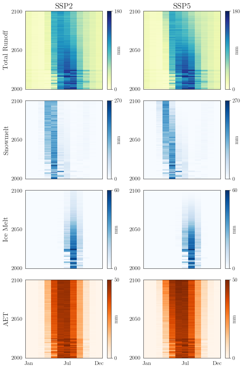
The second figure summarizes the ensemble means of the key variables in two-dimensional grids. This allows to easily identify changes in the seasonal cycle over the years.
total_runoff extracted for SSP2
total_runoff extracted for SSP5
snow_melt_on_glaciers extracted for SSP2
snow_melt_on_glaciers extracted for SSP5
ice_melt_on_glaciers extracted for SSP2
ice_melt_on_glaciers extracted for SSP5
melt_off_glaciers extracted for SSP2
melt_off_glaciers extracted for SSP5
actual_evaporation extracted for SSP2
actual_evaporation extracted for SSP5
Figure saved to output//figures/summary_gridplots.png
Finish line#
Congratulations, you made it till the end! We reward you with a virtual swim in the beautiful Issyk-Kul!

© Phillip Schuster
You can now explore your results, go back to refine your calibration or close this book for good.
Thanks for sticking with us and please get in touch if you like! Cheers!